Seeking insurance can be intimidating. For many, even just the word suggests confusing policies and misleading small print. This is where clear information communicated through human-centred design can come to the rescue.
The challenge Make it clear and simple
Accuro Health Insurance is a New Zealand not-for-profit cooperative. They treat their members as partners. We refreshed their site to make their human-first values shine through in every aspect of design, content, and usability.
Our approach Human-centred design to match human-centred values
Accuro’s research had revealed that people looking for an insurance plan have two primary concerns:
- that it covers their needs
- is affordable.
Research had also revealed that people often didn't know where to start with finding the right health insurance product.
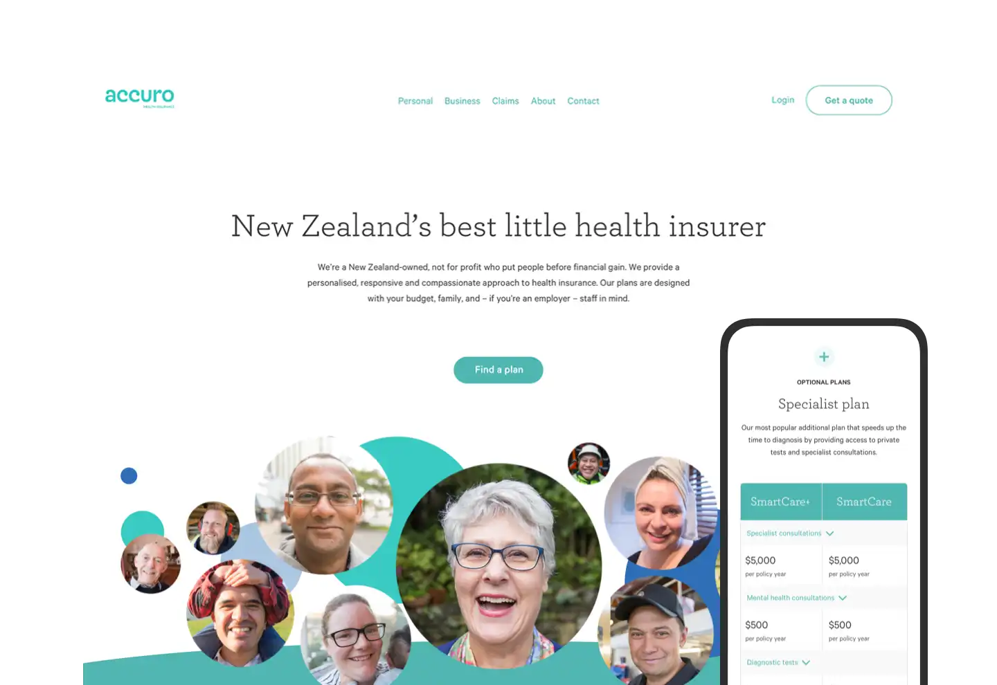
We developed a policy finder for the homepage so that the first thing users do when they come to the website is explore policies which could work for them. It is super clear — the first thing you notice.
Harmonious UX design and content strategy
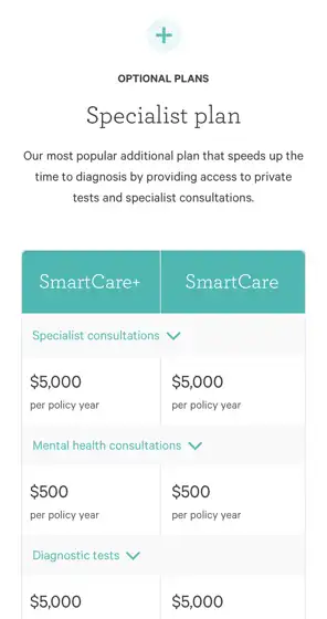
Along with easy to find, the insurance products needed to be easy to understand. Our UX designer and content strategist worked together to make insurance product summary tables that are user-friendly and responsive. Two comparable products can be viewed at once, even on small screens.
CSS styling allows the tables to condense down if the screen size changes, making products scannable and digestible. The new Silverstripe CMS allows Accuro to edit all the content themselves — something that was difficult to do on their old website.
of
Distilling the brand and weaving it across the site
Our market research into Accuro’s competitors helped us see how to make their brand stand out, and conducting inclusive brand workshops with the Accuro team made sure we fully understood their values and what they were trying to convey.
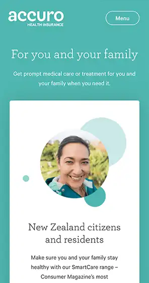
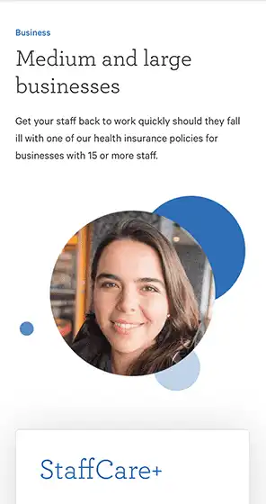
We distilled their curved pattern down to a circle, and carried this motif throughout the website with photo clusters of their members and staff. Accuro can change the images on each page and layer the animation in the new CMS.
A content overhaul
Content was a big part of the website refresh. Our automated and manual content audits surfaced multiple issues, so we made a new information architecture (IA).We also created a content model alongside a voice, tone, and style guide, and used these to re-write the website content into plain English.
The results People’s Choice award winner
The finished product is a great example of content, UX, design, development, and performance working in sync to make a simple and satisfying user experience.
To our delight, the website won the People’s Choice – Best Plain English Communication award at the Plain English Awards 2019.
Clear and helpful, which is refreshing for an insurance organisation!
Plain English Awards 2019
Previous
BRANZNext
MTF Finance