
As designers and developers of digital experiences, we need to deliver consistent, trustworthy, and highly accessible experiences to meet our users’ needs. Consistency breeds trust – but without structure and systems across large complex digital products, consistency is hard to achieve. This is where a design system can help.
What is a design system?
A design system is a complete toolkit of reusable components and guidance for design and development. It’s used to maintain a consistent experience and aesthetic across pages, websites, apps, and any digital experience an organisation provides to its users.
Design systems are an efficient way for internal teams to deliver a consistent external digital output. They help designers and developers focus on end-user experience, so are helpful when creating successful digital products. A well-produced design system enables businesses to scale design as needed, and provides a common language for internal communication and collaboration.
Brand guides and pattern libraries
Brand guides, pattern libraries, and design systems are sometimes used interchangeably. But the former are merely parts of the wider design system.
What is a brand guide?
A brand guide is a static document that shows the user how to represent an organisation’s digital brand. To add further confusion, occasionally it’s known as a style guide. The lines can blur a bit, but we see a style guide as focused on written content, featuring information for editors.
A brand guide might contain:
- how to use the logo
- image treatments
- fonts
- colour palette
- iconography
- tone and voice.
What’s missing: A brand or style guide can be a good starting point. It offers the user an idea of how to reproduce a company’s look and feel, but does not feature the modules for building it, and so it lacks real context.
Examples: Dropbox brand guide | Mailchimp voice and tone
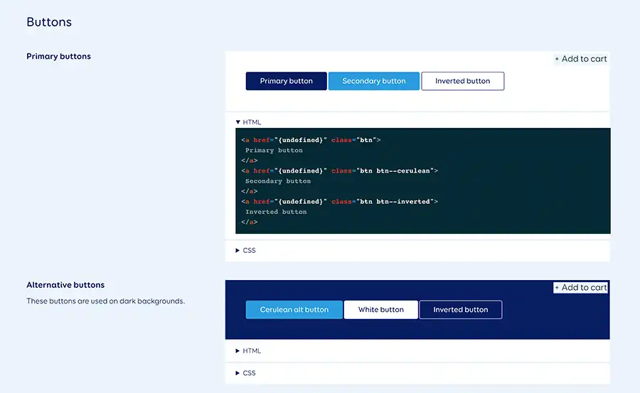
What is a pattern library?
A pattern library is a set of reusable HTML and CSS components that a developer or designer can use to assemble a digital experience. Think about these as building blocks in the form of code samples, pattern names, visual representation, and design elements.
The library might include:
- headings
- typography
- buttons
- dropdowns
- input fields
- accordions.
What’s missing: While the user might have all the modules to build a page, they don’t have any guidance on how to assemble them properly.
Example: We built a pattern library for LIC to use across all of their digital products.
Design systems complete the picture
A design system builds on the modules of a pattern library with the guidelines of brand and style guides – it also offers a lot more. Comprehensively, it covers all contexts and provides reasoning behind the guidelines. The design system is for any internal stakeholder, allowing teams to:
- communicate under a shared language
- work and scale design with efficiency
- continuously deliver with quality and consistency
- establish robust principles so that design doesn’t suffer as staff come and go.
From a designer’s point of view, all projects that we build have a design system, but it’s often in our heads and working files. Developers are the same, although they often put notes and instructions in Github or similar. All the components of a design system are there in anything we build, it’s about refining then documenting it so that it’s clear to others.
Senior Designer
When not to use a design system
A design system is necessary once a certain scale is reached, and the organisation has achieved product-market fit (they know their offering is in demand).
Small or fast-growing organisations may find it unnecessary and inefficient to spend time creating a design system, when things can change substantially in a short period. A complete design system can be a large up-front investment, and if it ends up being unnecessary or unfit for purpose, it can be detrimental.
A stand-alone brand guide or pattern library is often sufficient for organisations in this situation. Brand or style guides can help establish a consistent look and feel. A pattern library would help an organisation developing a website or app, capturing components and allowing for continuous iteration.
Both are less intensive to produce, have a lot to offer, and can be further developed into a design system once the organisation is ready.
How we use design systems
We use design systems to maintain our focus on delivering human-centred design solutions to our clients. They also provide added value for clients as they can be used across other digital products in addition to the product we’re building.
MyACC: using a design system to maintain accessible and inclusive design
MyACC makes it simple for ACC customers to manage their claims online. We built a design system for the app with a strong focus on accessibility and inclusivity. This focus was important because ACC’s users:
- were potentially injured or experiencing pain and discomfort
- could be anyone in New Zealand, with any mindset, needs, or level of digital capability.
To create the design system for MyACC we applied learnings from multiple design iterations and user testing sessions. During this research we included people whose culture or background may prevent them from asking for help easily, or who had injuries that led to challenges with using various forms of technology. More importantly, we tested our designs catered to all customers so we could be confident they would meet ACC’s goals of simplicity and user-empowerment.
This research and testing phase was crucial in the development of a set of design principles, which are implemented throughout the design system – guiding the addition of new features and updates.
All-of-government design system: building on best practice to make it easier to solve end-user problems
We’re currently working on an all-of-government (AOG) design system with the Department of Internal Affairs (DIA). Our goal is to create a design system that makes it easier for digital teams and vendors to design, prototype, and ultimately solve end-user problems. We also want to enable collaboration between practitioners and government agencies, fostering innovation in digital service delivery for users.
We’re basing it off three tried and tested design systems:
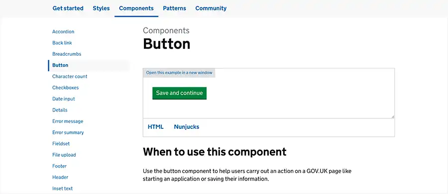
GOV.UK. in particular is a renowned best practise case of user-friendly design, which is why we’re using it as the primary basis for AOG. Rigorous research, testing, and multiple iterations have led to a highly applicable design system for all UK government departments, as well as an exemplary reference for anyone constructing their own design system.
We're using it as our foundation to solve end-user and government problems, some of which are specific to New Zealand. We’re also planning to build on some of the additional features our design system supports that the GOV.UK. doesn't currently.
Defining your design system
If you think a design system might be the right solution for you, please get in touch. Whether it’s a pattern library, brand guide, or complete design system – we can help you find what’s appropriate for your needs.
Get in touch
Let’s make the things that matter, better.
Email: hello@springload.co.nz
Phone: +64 4 801 8205