What we're proud of
10%
increase in first-time-user orders in the first year
7%
increase in customer retention in the first year
A new, mobile-first app design that also works on the web
A consistent online brand, aligned with the physical one, with increased online accessibility standards.
The challenge Keep the food coming, during a pandemic
Delivereasy is a New Zealand-owned online food ordering and delivery service, operating mostly via an app. With more and more New Zealanders wanting to support great local initiatives, and with the need for contactless delivery services skyrocketing due to Covid-19, Delivereasy was experiencing incredible growth. They wanted to seize the moment, reach new customers, and keep people connected to their favourite local eateries.
Delivereasy came to us for new visual design and a better user experience to support their growth and help them stand out in a competitive field.
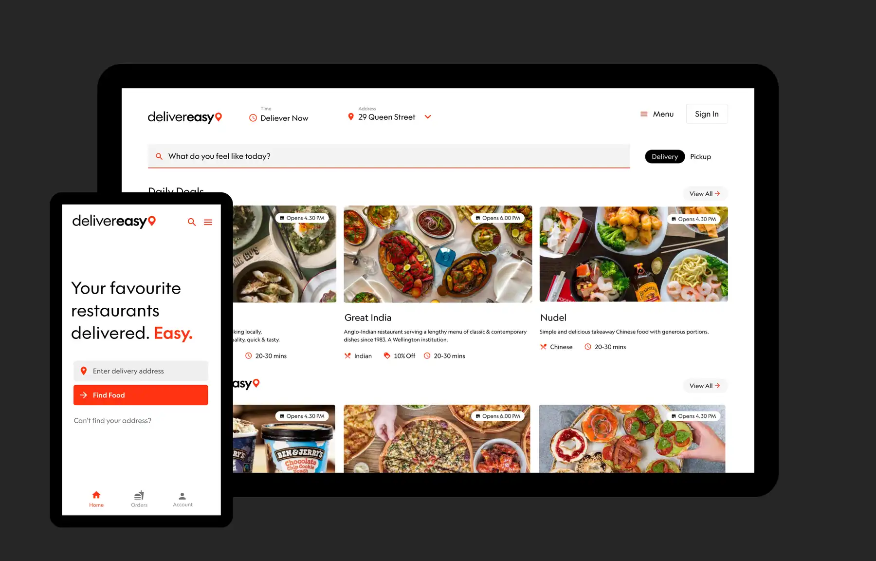
We redesigned their brand, design system and the user interface for their customer app, website, and back-end tablet app that the restaurants use to manage the food orders.
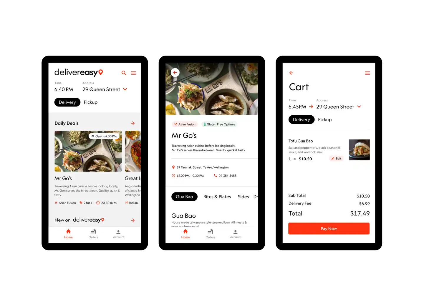
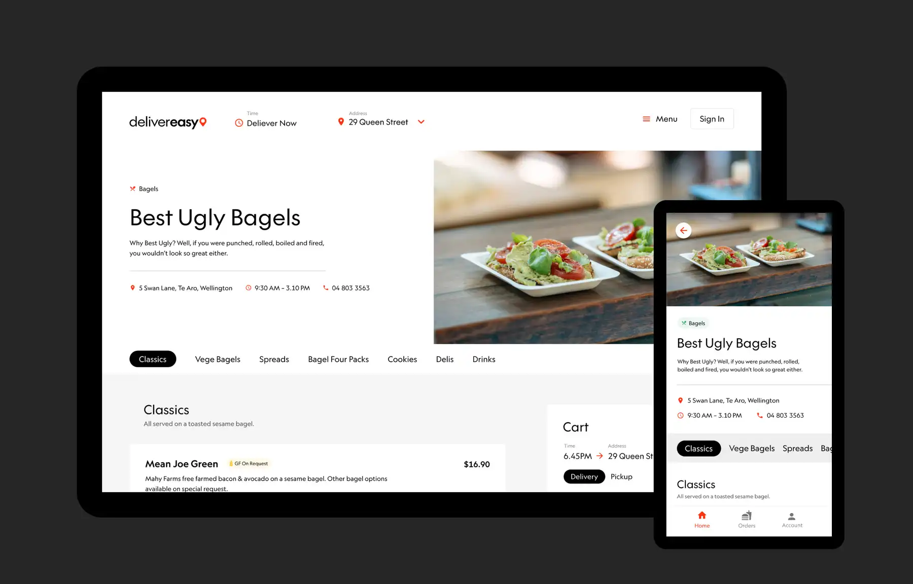
Our approach Mobile-first design
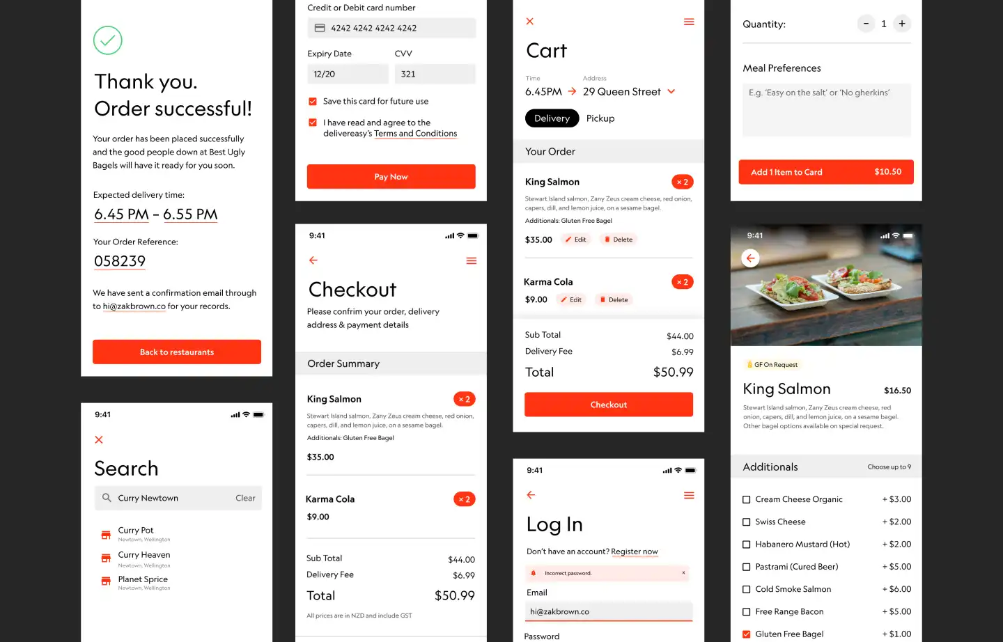
As the customer app is the platform that gets the most use, we followed a mobile design approach, designing for smaller phone screens first. This meant careful prioritising of information to get that fine balance between communicating how many food options are available, and not overwhelming the user with choices. We went with vertical scrolling for different categories of food and drink, and horizontal scrolling for the restaurants within that category.
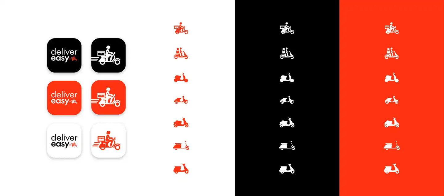
Brainstorming and iterating on the logo
We created a new logo and explored a variety of options along the way, including a little scooter person.
We iterated on our designs, presenting Delivereasy with a variety of options that reflect who they are and what they do. In the end, they went with a logo that was similar to their previous one, but elevated and refined.
Exploring options together was not only great for opening everyone up to new possibilities, and for confirming that the logo they already had was strong, it just needed some developing.
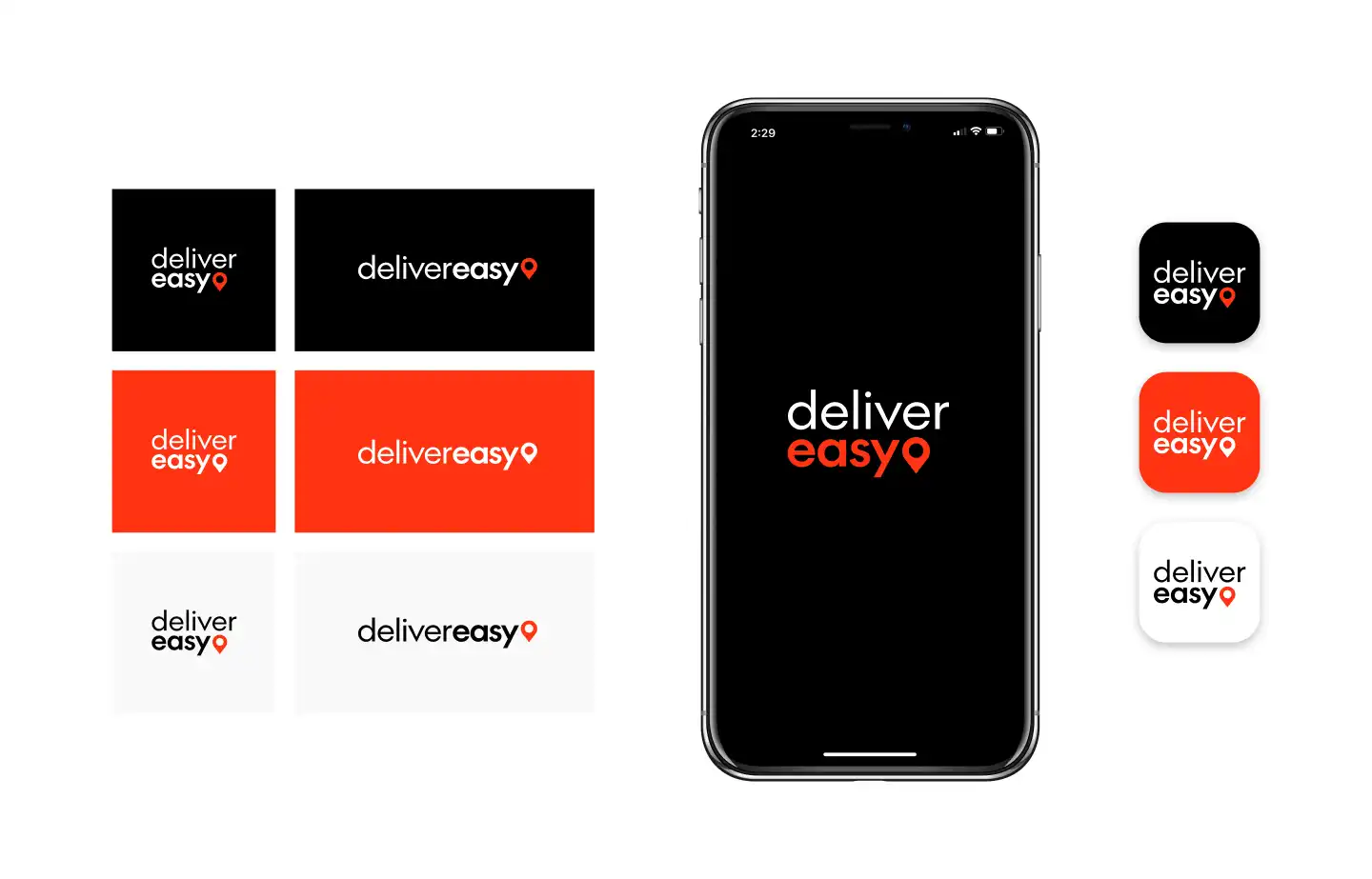
Aligning the physical and digital brand
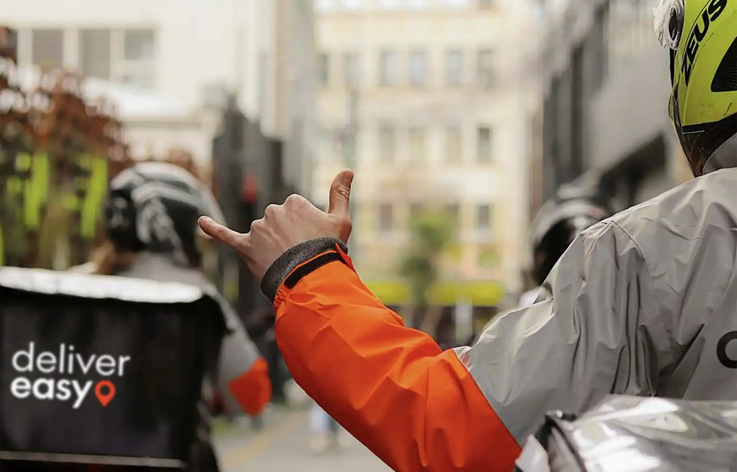
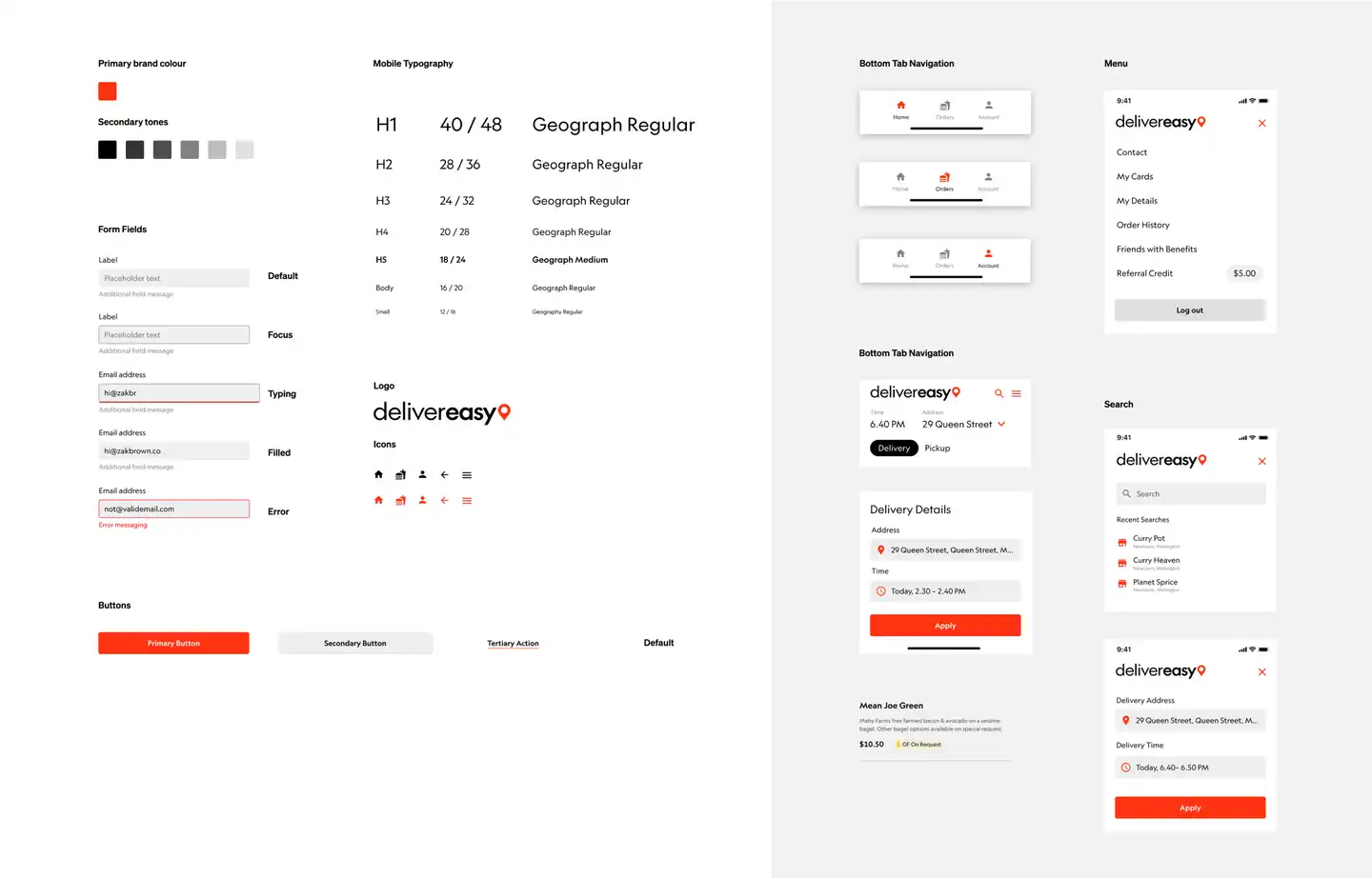
Out on the street, Deliveryeasy’s delivery people are recognisable on their scooters, in their orange and black jackets. But their digital brand colours were teal and white. We wanted to match their physical brand with their digital one. We changed the colours of their digital brand to bright orange, white and black. This aligned with their real-world look, and it also increased online accessibility, as the contrast of white on teal can be hard for some people to read.
of
A new font for a consistent visual experience
Delivereasy had been using three different fonts across their brand and content, so we put in Klim Type Foundry’s versatile Geograph across everything. Having the same font across the logo, brand, and content makes for a consistent visual experience.
It’s a similar typeface to the ones Delivereasy was using before, so it retained the familiarity while elevating the visual style. It’s also easier to read, and its 12 font styles mean it scales well across all areas of design. Geograph also has great legibility at a small point size, so it lends itself well to mobile UI design.
Designing for Flutter
Delivereasy’s in-house development team uses Flutter, a user interface toolkit for building web and mobile apps from the same codebase. We designed with this in mind, creating a single central design that works for both web and mobile. Delivereasy’s team can now use this design system across every part of their product, saving them time and cost.
User testing with Figma prototyping and synthesizing with Miro
We designed in Figma, which was great for allowing numerous people to work together on the designs at the same time — particularly helpful as we did a lot of the design work remotely during lockdown 2020.
We used Figma’s prototyping feature to test our designs and user flows with a diverse mix of people, using real smartphones. We synthesized the findings using online whiteboard Miro. User testing validated our design choices and showed us where we needed to make changes to improve the experience, like making sure the delivery time was front and centre.
The outcome Delivering a great customer experience
Delivereasy’s new design is eye-catching, cohesive, and the ordering experience is streamlined.
While we were working on this project, Delivereasy expanded its service to more regions. Now all across Aotearoa restaurants can keep afloat, people can keep eating their favourite foods, and communities can stay connected.
With their new brand and app, Delivereasy isn't just delivering delicious food — they're also delivering a great, and easy, customer experience.
Our customers can find the food they want faster, easier, and with more confidence they're getting the food they think they're getting.
Chief Technology Officer, Delivereasy
-
Previous
Again Again -
Next
ACC