The challenge Designing a human-focused brand and flexible design system that can be used for everything
Being a small, local service in a competitive national market doesn’t have to be a weakness — in fact, with a strong brand to deliver them, your community values can be your edge.
NOW Phone and Broadband, a small, Hawke’s Bay-based customer-focused telco company, needed a brand refresh to reflect their recent growth.
We worked with them to create a scalable design system that they could use across every facet of their business, and incorporated it into the new website we were developing for them at the same time.
Our approach Working fast and furious
NOW had a tight budget and deadline. In the space of just two weeks we:
- collaborated with their team to understand the core attributes of their brand and how they relate to their customers
- conducted market research to identify typical trends and ensure they’d stand out
- refreshed the brand and created a whole design system.
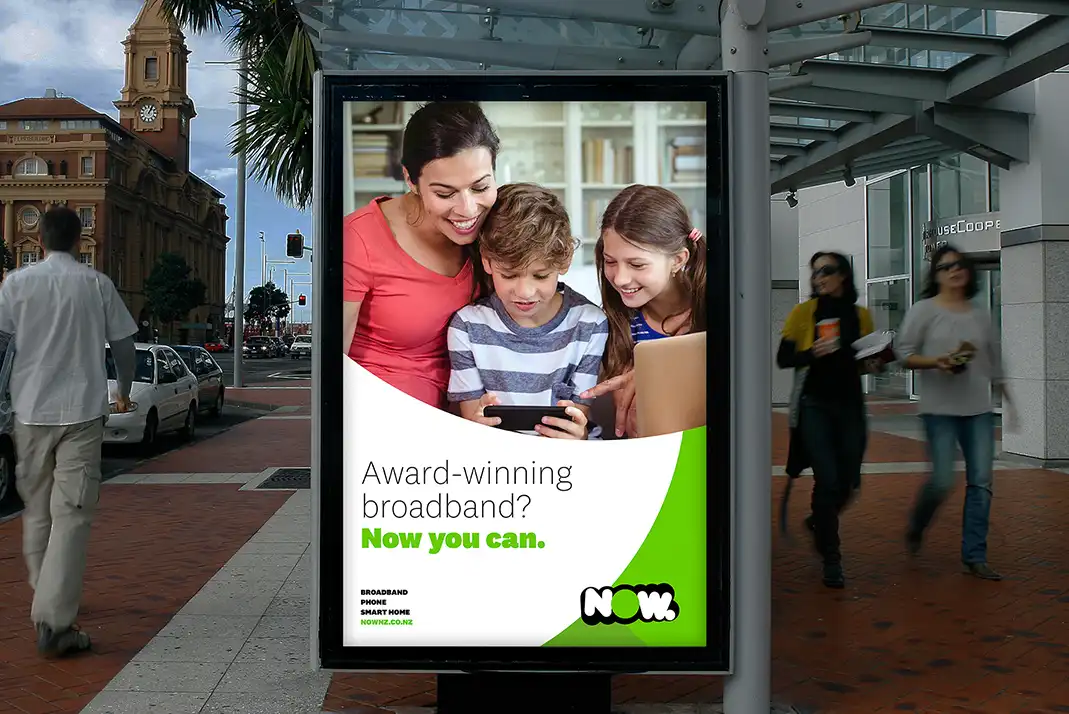
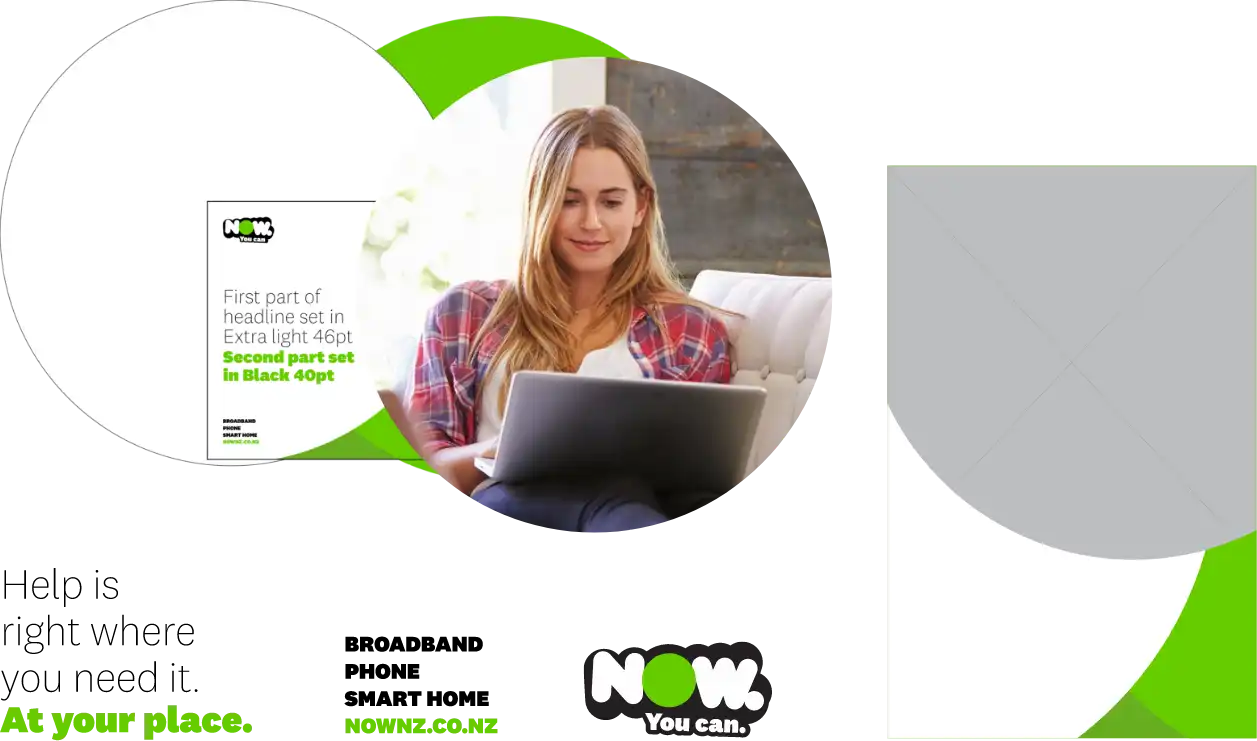
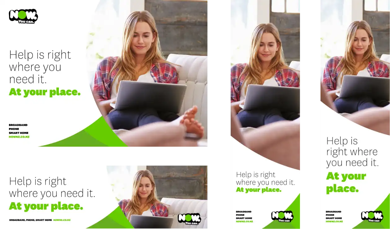
A suite of graphic devices
We made a flexible brand system with the ability to dial up or down the use of text, imagery, and graphics. We created a suite of graphic devices including cropped circles, variations of the colour scheme, unique stock imagery, and multiple additional shapes. These can be flexibly applied to all types of promotions and branding, from billboards to business cards to the new website.
This flexible brand system means materials can be put together when and as NOW need, without the need to always employ a designer for every new little thing. This makes it cost-efficient going forward.
of
Broadening the identity with a pop of colour
Our market research identified a typical trend of blue and purple colours in the telco industry, so we steered away from those. Sticking with NOW’s energetic green made sense for holding on to their identity as well as standing out from the crowd. We introduced a sprinkling of bright yellow to highlight key details or calls-to-action on the website. This pop of colour did wonders for broadening the brand identity.
A font that speaks like NOW
Klim’s National 2 font is great for a flexible brand system — it’s a large and dynamic type family so provides lots of options with fun and unique personality.
A lot of NOW’s existing ad copy was structured in a ‘call-and-response’ arrangement. Pairing Klim National 2’s heavy and lightweight font-types was ideal for communicating this.
The new brand identity has brought NOW forward 5–10 years.
Head of Marketing, NOW
The results A huge increase in website visitors
Since using the new brand system to create business cards, proposals, ads and plenty more, NOW has gone from strength to strength. Thanks to the refreshed design, they have seen a 58% increase in website visitors from display ads.
It’s allowed us to spend more time on developing better ideas and less time worrying about how we’re going to make it look – the brand identity has it covered.
CEO, NOW